I helped Cycleau inspire the next generation of water activists through their online learning platform.
Meet the crew:
Worked with 3 other UX designers
Led user research and usability testing
Joint scrum-master and project manager
Rapid iteration:
3 week project
5 client collaboration sessions
Results
Focused on scalability of the platform:
Content guidlines
Style guide
Comprehensive content template library
High-Fidelity prototype of one lesson.
Imagine going for a sip of water, but knowing there's a chance it will make you sick
Imagine turning on your sink faucet and nothing came out.
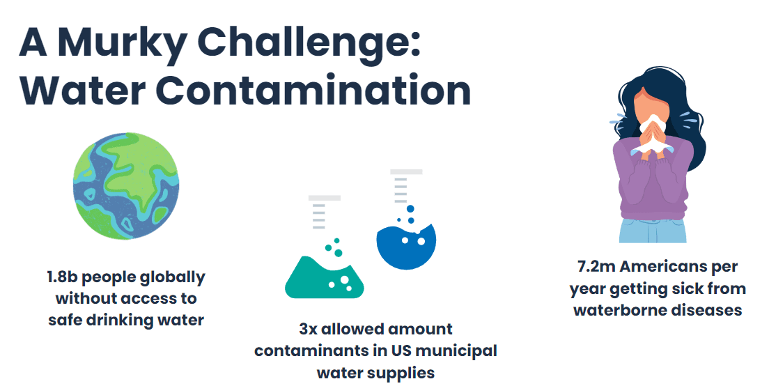
Every year, 7.2 million Americans get sick from waterborne diseases, and 1.8 billion people globally do not have access to safe drinking water. Cycleau has developed a greywater system that treats and recycles 80% of used water. I helped them design their educational platform to build trust and awareness about the safety of treated greywater.
Picture of water
Would you drink the water that just drained out of your shower? Apparently I had already been doing it!
I studied abroad in Singapore for a semester, and I recently learned that 40% of the tap water I drank was reclaimed greywater using a treatment system. Singapore won the trust of its people through a dynamic education campaign about the quality and benefits of recycling water. Cycleau is approaching the problem from a similar angle and it looking to make an impact on the water scarcity problem by educating the next generation of activists: middle schoolers.
Stepping back into the classroom and forming a research plan to learning more about our middle schooler audience.
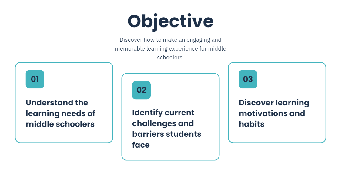
My team and I had long since graduated from middle school and had little exposure to middle schoolers in our extended circles. I wanted to make sure we were creating something that would be relevant, enjoyable, informative, and guided by user insights. The first step of our research plan was to understand how middle schoolers best learned online.
Journey map like image starting from now -> learning needs -> solution -> ???
Permissions and privacy: setbacks in recruiting middle schoolers to interview
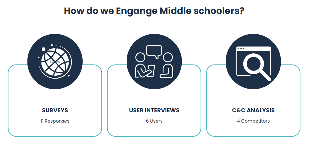
Sometimes plans get thrown out the window! When we initially signed on to the project, we had the expectation that our client would be providing users to interview. However, the middle school they had partnered with had to pull out, as they couldn't get permission slips from the parents in time for our project. Understanding user needs is key to setting up any project for success. Faced with a tough situation, we hastily leveraged our networks and communities to find middle schoolers with a suitable background. Through multiple posts, requests, and filter surveys we found 3 middle schoolers and 3 teachers to interview. While it wasn't the perfect situation, I was gratefully to get them on such short notice.
Small picture of group of 3?
Setting up our interviews for success with a user interview guide
Once we had our middle schoolers on the books we dove into creating our user interview guide. I took the lead on making sure our questions would reveal accurate and meaningful insights to guide our design. I did this by brainstorming a mind map that revealed the various areas and topics of online learning. I brought my team in to check these topics and see if I had missed any, and we came up with a few more. I then got to work crafting up questions for each topic. I crafted my questions to create reliable and accurate data by to avoiding leading questions, asking about specific instances, avoiding yes and no questions, and avoiding compound questions. After a quick pilot test and some editing to make sure all of our questions were applicable, I got to work interviewing our users.
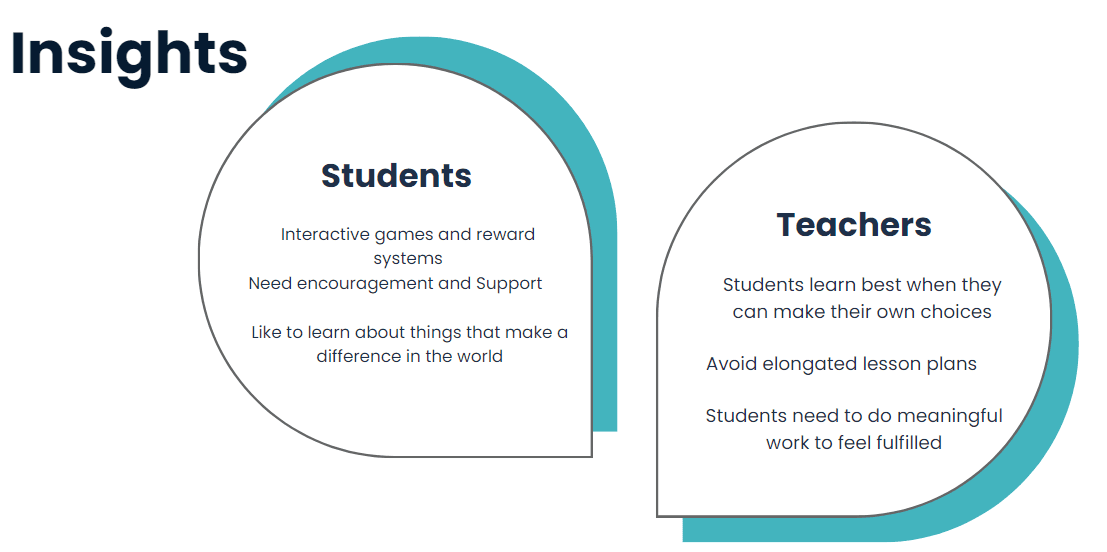
Collage of 3-6 middle schoolers and teachers with the key insights.
Building trust, a sense of belonging, and continously asking "why" in interviews
I approach interviews from a place of empathy. I understand how I would feel as a middle schooler if I had to join a zoom call with a stranger and talk to them about my online learning and how I felt about it. The first things I try to establish with my interviewees are trust and a sense of belonging so we can reach into their true thoughts and beliefs. In this case I let them know that there are no right or wrong answers and that they can think of me as a new friend to chat with. Most calls were facilitated by a guardian and I wanted to be mindful of their time and privacy so I reassured them that the interview would only take 30 minutes and that all data would be kept confidential. This helped my interviewees feel comfortable and they dove into our questions. When asking a question I would always dive deeper by asking "why?" This would often reveal an underlying value or core need. These findings would become the foundation for our design insights that we generated through our affinity map.
User interview guide
Introduction and Safe Space
Warm Up Questions
Exploratory Questions
Conversation Debrief
Distilling insights into design requirements
We made an affinity map and found the best insights by looking at how many users were represented in each category in addition to the quantity of data points. Each of us did a few passes over it trying to consolidate themes and approach the mapping of their needs with our collective perspective. This helped us categorize difficult themes or see connections between insights that we didn’t recognize at first. With all of our data points categorized we summarized them with actionable “I statements”. This would allow us to easily recall our key user needs and frustrations as we continued down the design process. Using our insights my team and I created a representation of our user's needs and frustrations in the form of our persona Jose. Jose helped us keep in mind our user needs when designing our solution.
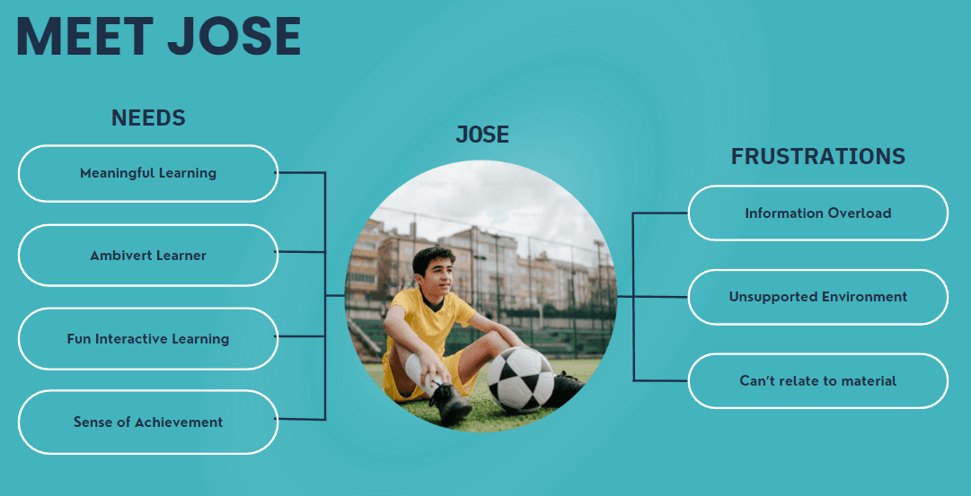
Persona with highlighted needs and annotated sections with why I included them.
Focusing in on our most pressing user needs and broadening our solutions
We now had a good understanding of what middle schoolers needed to learn successfully so we began brainstorming and sketching solutions. It is important to think broadly and creatively with solutions so we don't miss out on great ideas. We drafted a problem statement that focused on our most impactful user need and then generated how might we questions. These resulted in numerous sketches. Most of our ideas revolved around creating e-learning platforms, but our solutions each had different types of interactive modules and storylines to keep the middle schoolers engaged. Little did we know we would soon have to make a design pivot!

Problem statement visual:
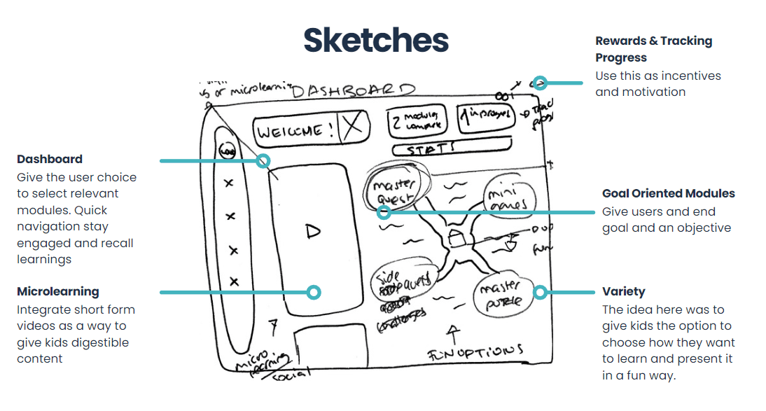
Picture of sketches and early wireframes (from slides)
Working with limited content. Client alignment and design workshop
As we were designing our solutions, we were under the impression that Cycleau would have detailed content that we would be able to test with. However, at our next client meeting we learned that it was more of an outline than an actual step-by-step module plan. Additionally, we learned that they didn't have the budget or capacity to create a highly interactive and technically complex e-learning module. We immediately began to work with the new scope and I hosted an impromptu design workshop with our client. This gave us the opportunity incorporate our client's thoughts and gave us the opportunity to set realistic goals for the next two weeks of our project. Checking in with our client early in the project and including them in the design process allowed my team and I to focus on creating the best solution that could fit our client's needs.
Design workshop screenshot from zoom call? Whirlpool of our sketches swirling around?
Pivoted to guidelines and content templates. Testing the flow and engagement of a lesson.
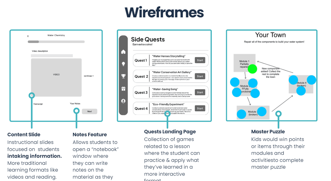
I suggested we focus instead on creating guidelines and content templates that would help Cycleau scale and create engaging and meaningful experience. This idea quickly gained traction and we quickly made this our new focus. While we had our new end-goal in mind, we also wanted to create a prototype lesson to test the intractability and flow of the e-learning platform. We created a 10 minute high-fidelity lesson to get feedback on and improve our design. While we weren't content experts and didn't have content to build off of, we tried our best to create a lesson that reflected the learning material we expected Cycleau to use.
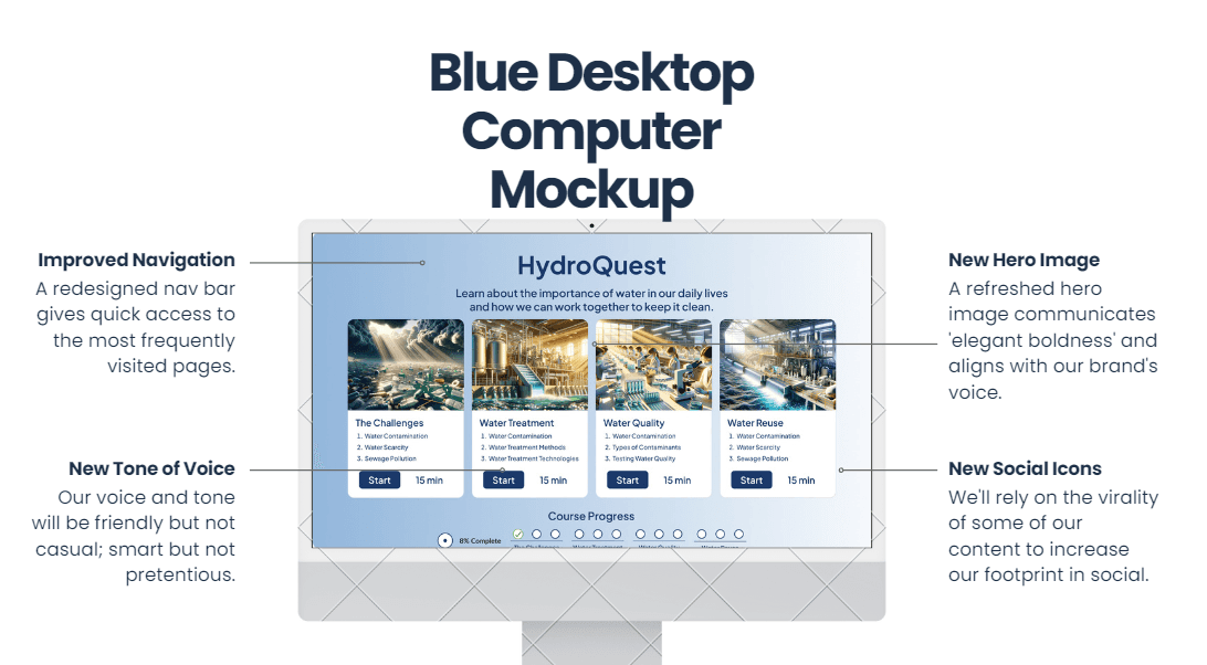
Protoype walkthrough of high-fi
Using our High-Fi to test engagement and flow through usability tests
We utilized our high-fidelity lesson to test the flow and gauge the interactivity and engagement. Over 3 usability tests, we gained many insights, which we incorporated into our scalable library.
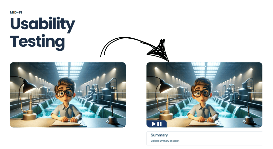
Usability testing results and changes
Creating the templates for future success
Instead of creating an overarching storied learning module, we focused instead on creating content templates that would help Cycleau scale and create engaging and meaningful content. I identified key interactive activities through external academic research and my team and I created 9 templates. Each of these templates was annotated to guide the Cycleau team with their future content to satisfy student's learning needs. We additionally laid out the look and interactivity of each module so that it could be accurately recreated by a future developer or designer.
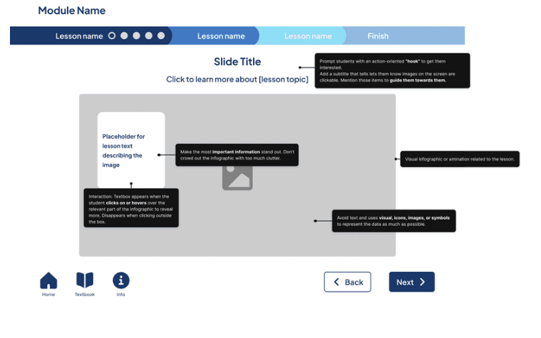
Annotated screen
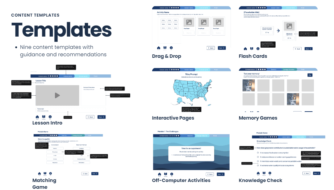
Collage of different templates, layed out in a diagonal grid.
Building the ultimate middle schooler e-learning handbook
Finally, we created content guidelines which included our engagement principles and style guide. We designed our engagement principles with our user needs in mind. Our persona was very useful in being able to quickly identify needs and act on them.
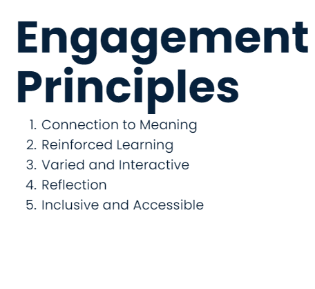
Engagement princples book/computer screen with annotations comming off of it (5 princples)
Our style guide laid out the typography, visuals, and optimal student line length. We included these to help Cycleau build out their e-leaning platform with the confidence that it would place well with middle schoolers.
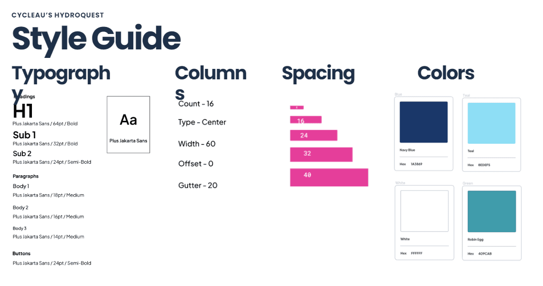
Style guide
Key takeaways and lessons learned
From design pivots to working with a young user base, this project grew my ability to adapt to new and unknown situations. In design, not everything will go as you expect - and that's what makes this field amazing. I'm excited to embrace these unexpected changes in the future and to work with them, rather than against them, to build amazing products and experiences.
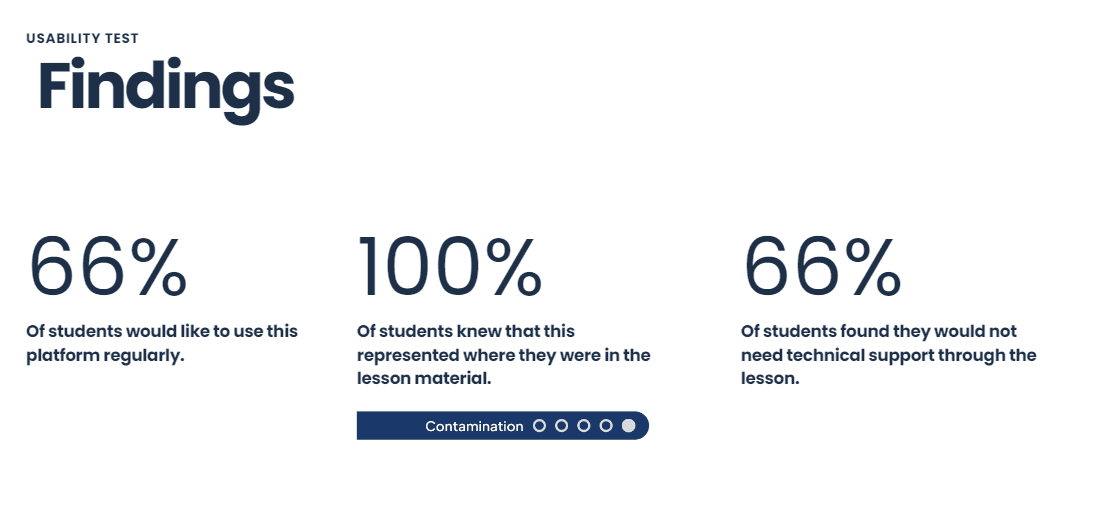
Sus survey results here or on top? Maybe some other image…
Looking for an edge to build user data driven designs?
Feel free to use these guidelines and templates to create an engaging and meaningful experience for your own users, or contact me if you would like to work together!